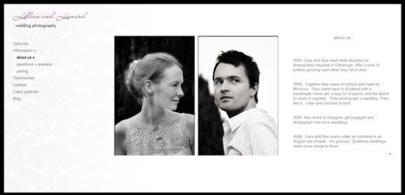
Finally, after hundreds of weeks and millions of years we finally finished tinkering with the new website design for Lillian and Leonard last week and it has gone live. Now I can go to bed without lying awake all night debating smoke grey vs cloud grey and whether it's ok to have, you know, personality on a wedding photography website. Maybe.


well done. the site looks fabulous.
ReplyDeleteWow, it is pretty. I love your ABOUT US..."politely ignoring each other" hehe, lovely:)
ReplyDeleteIt's gorgeous, and the photos on the first page brilliant.
ReplyDeleteI love the simplicity! It looks great!
ReplyDeleteGorgeous! Love how clean and elegant it is at the same time!
ReplyDeleteWe are so proud of you. It is the fabulousist.
ReplyDeletelooks lovely, you're a handsome pair and no mistake.
ReplyDeletejust one tiny-weeny thing - under questions and answers - how to book us - necessary is spelt incorrectly. sorry, i AM married to a copywriter, you know.
gorgeous, truly -- and the personality I saw (in the "about us" section?) is utterly delightful :)
ReplyDeleteOh, Cara, it's beautiful. And the shots of you two? Could you two be any more gorgeous? And talented to boot. It's all just perfect. I love it.
ReplyDeletexo,
-maria
I loves it! I love the pictures you two chose as well! Beautiful!
ReplyDeleteit's beautiful, cara and nye! love it!
ReplyDeleteand i love how you tell who lillian and leonard are... that totally does deserve an awww.
congrats!
ReplyDeleteOh dear me, i hate wedding photo websites, but i just spent like 15 mins playing on yours. thumbs up to you!
ReplyDeletethe site is stunning! well done :)
ReplyDeleteIt is so beautiful. I always thought that I wouldn't want to even have a wedding photographer if the day ever comes but for a while now I've been thinking that you might have changed my mind...
ReplyDeletereally, really well done.
ReplyDeletethat head shot of nye?
he looks so serious and rugged and handsome. good.
yay! it looks fabulous. your photos? so amazing, i die.
ReplyDeletebeautiful website!
ReplyDelete*Your* personality? Yes please!!
ReplyDeleteLove it :)
GASP. So beautiful. You must be so pleased. CANNOT WAIT to meet you two. Cannot assure you that I will not immediately put you in my pocket.
ReplyDelete