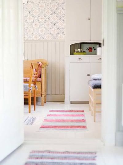
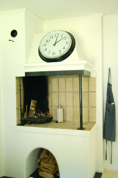
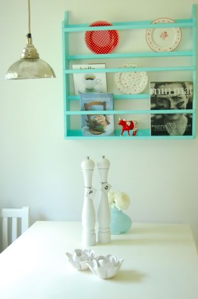
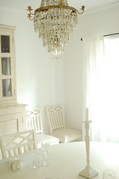
Ikea, while wonderful in many (well, some) ways has done bad things for my image of Swedish style. Without my noticing I became quite convinced that our houses are now full of melamine crap because Swedish houses are full of melamine crap. How wrong I was. Since her move to Sweden Chelsea has been helping me see the error of my ways and showing me that the 'white with splashes of colour' thing that I've been hoping to achieve in our house is the essence of true Swedish style. Don't these pictures of Swedish interiors have a little something ikea about them? But I challenge you to find a single recognisable product in any of them.... first picture from Sköna hem, via Ill Seen, Ill Said, via {frolic!}
. all other pictures by Chelsea, via {frolic}
Wednesday, September 23, 2009
A Little Sweden...
Labels:
Nest Building
Subscribe to:
Post Comments (Atom)


I love that third picture. The white seems so soft, and that pop of blue is just perfect. I'm loving all of her Sweden posts.
ReplyDeleteHa! I like this post. Glad you enjoyed the photos. THe cottage I am living in is furnished almost entirely in IKEA. I will post photos soon and then you can see if you like it:)
ReplyDeleteI feel the same about IKEA.. it gets old fast.
My mother's husband is Swedish. While they now live in Santa Barbara, CA, for some time they lived in Sweden. Which means I have been there several times. About 17 years ago I remember I was so excited about their furniture I brought home a bunch of Swedish magazines. And of course I could do nothing with them. The antiques are also beautiful. Maybe it's time for a TRUE Swedish style revival?
ReplyDeleteI love Swedish design - it can be soothing a serene, with all its whites and grays and blues, but it can also be incredibly fun and invigorating with all the colorful patterns found in vintage wallpapers and tiles...
ReplyDeleteAnd... about those interiors, though:
http://www.ikea.com/us/en/catalog/products/60098975
I hear you about Ikea, and it is a heated debate about its merits and, well, lack of merits... I'm on the fence about it. Of course I would choose an antique over an Ikea piece, but I can't always afford it... And I do like that their design aesthetic is inherently Swedish, which of course, I love. So.
-maria
Ooh, I love the blue book/dish rack. I agree about Ikea, occasional great finds, but for the most part I don't like the style. And I can't follow the "how to" put together guides to save my life, or the furniture.
ReplyDeleteLovely... Would love to go to Sweden one day, there's something about the people in Scandinavia, not only their design but their approach to life in general -makes me think that they get something that we just don't.
ReplyDeleteAgreed about IKEA, good and sometimes even great ideas, and among it a lot of cr*p. Still here between the cheesy low-end stores and wonderful high-end design stores who sell stuff we can't afford, there's not much choice and so I still do appreciate the Swedish big box.
i've been loving the goodies chelsea has been posting as well. and ikea and i have a pretty good relationship, but i would eventually like to grow out of it ... at least in a serious way.
ReplyDeleteG. and I have a thing about big solid pretty salt and pepper shakers lately. Like those. Love them. I am so weird.
ReplyDeletehmmm, I'm not entirely convinced that that is THE ikea clock but it could be.
ReplyDeleteChelsea, that's really interesting about your cottage, I can't wait to see it!
The simplicity of them all is quite breathtaking. Though, I must confess, I do still love Ikea.
ReplyDeleteBeautiful pics.
ReplyDeleteI still like IKEA as it's affordable, but I'm growing out of it a little. Their catalogue hasn't the same appeal to me as it had 3 years ago...
But I still find things to buy whenever I go ;-) (hello frames for our wedding pics !). And I think our futur wardrobes will come from here (the expensive ones, not the crappy cheap one we've already got).
I'm pretty sure it's the smgørund and next to it the ügrinderrøg, no?
ReplyDeletekiding. I'm completely seduced by that look, with or without ikea.
These pics are gorgeous and not IKEAish at all! I too have a love/hate relationship with that place.
ReplyDeleteI just love these pictures... the blue shelf/rack is so adorable. I'm really liking your blog, would you like to swap links? :]
ReplyDeletehttp://sarah-pandoras-box.blogspot.com/